

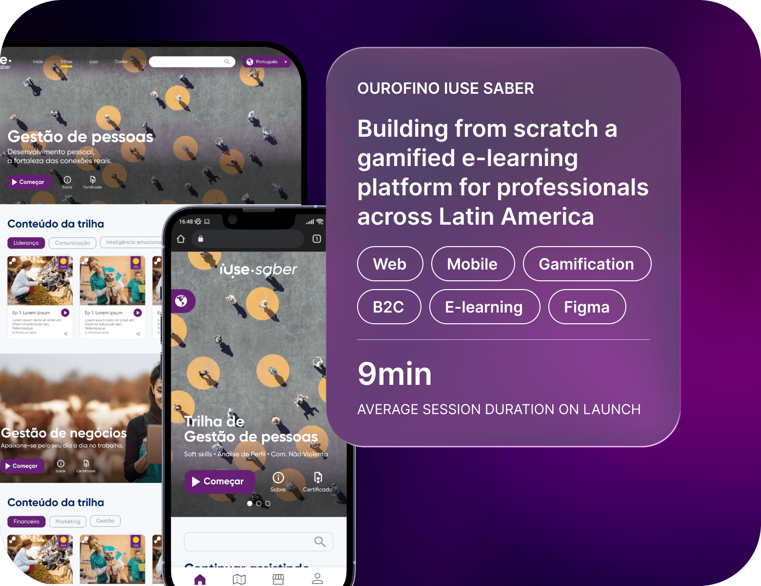
Ourofino - iUse Saber
Building from scratch a gamified e-learning platform for professionals across Latin America
Client
Ourofino
My role
UX/UI Designer
Date
April 2022
Overview
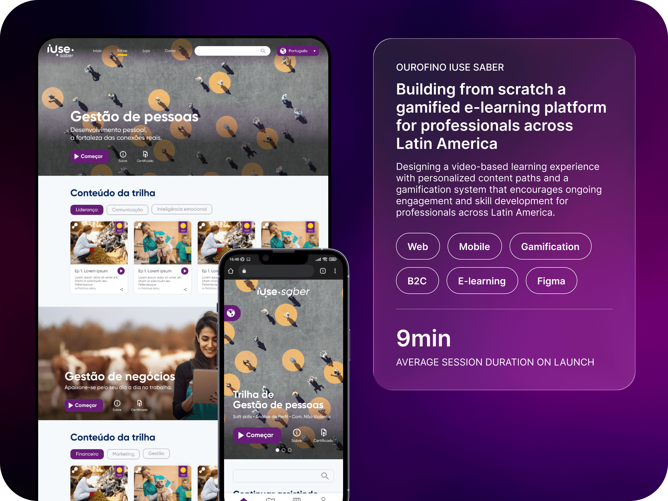
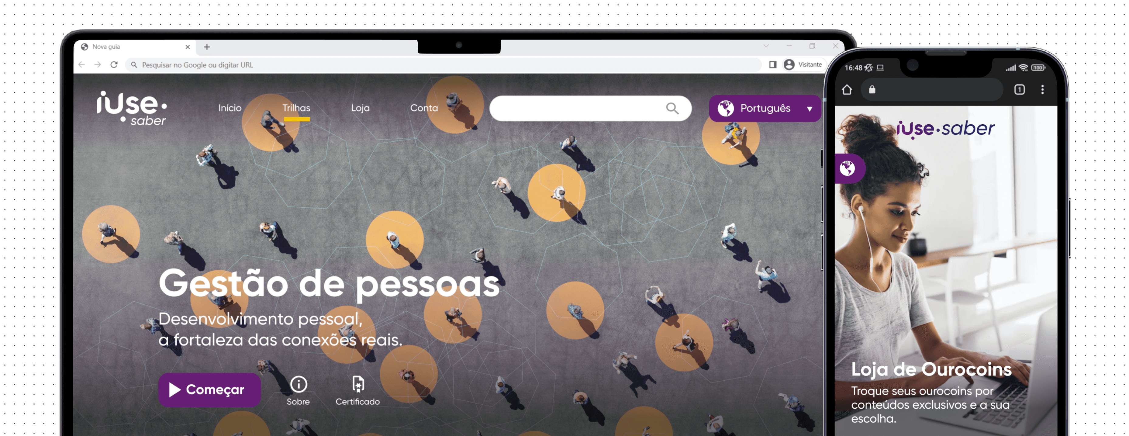
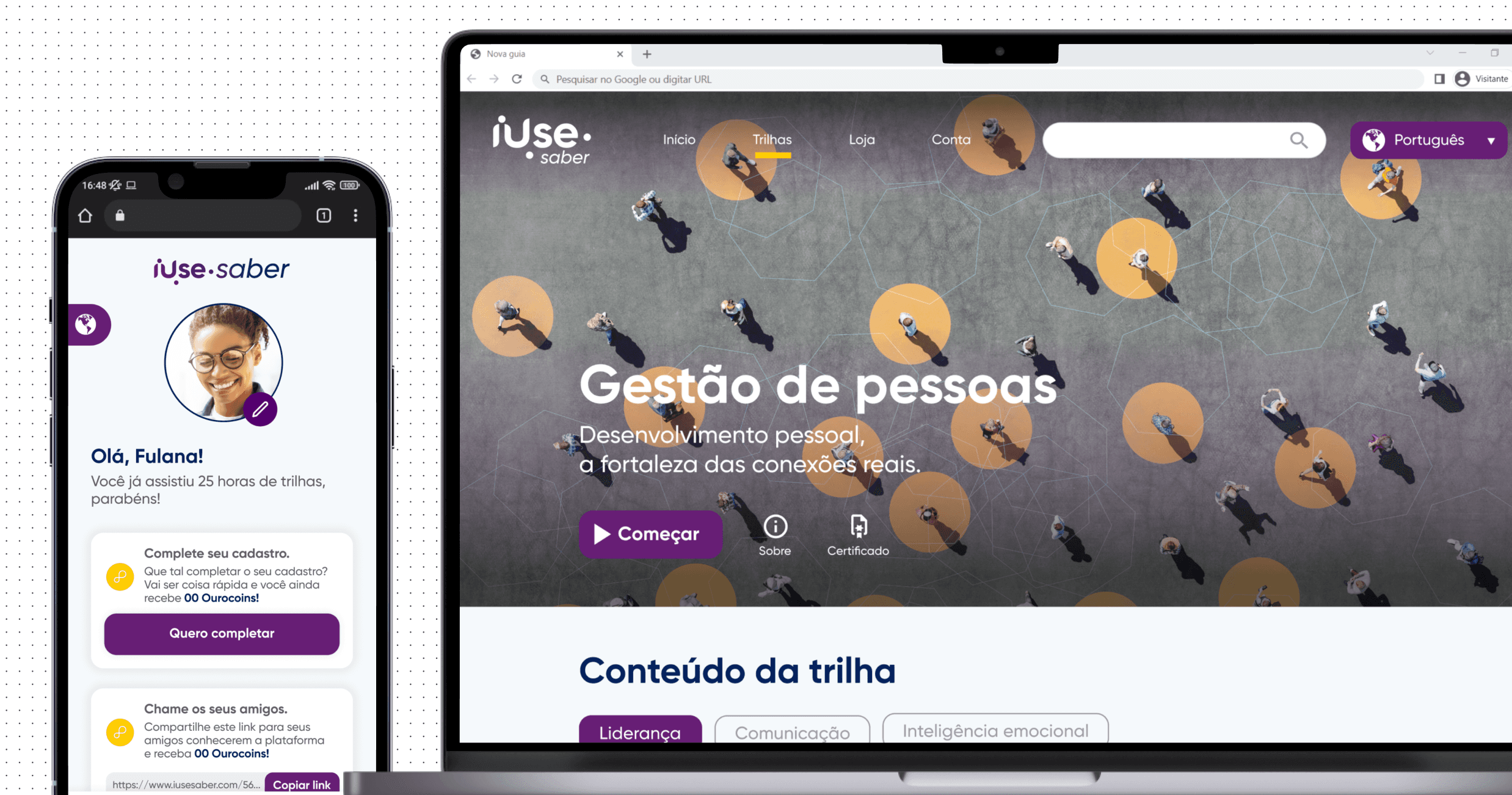
iUse Saber is Ourofino's video-based learning platform aimed at individuals seeking personal and professional growth. It features a gamification system to reward users and focuses on providing a personalized experience based on the content watched.
Problem statement
Ourofino set out to create a new mobile web learning platform, iUse Saber, to support personal and professional development for animal health professionals. The challenge was to design a customizable platform with knowledge trails, gamification, and virtual rewards, enabling users to access premium content for free. Without this solution, professionals would continue to face high costs and fragmented resources, limiting their growth and connection to the brand.
Goals
My goal was to create a new solution for producers, managers, tutors, technicians, clerks, and students throughout Latin America that would have the following features:
Allow users to choose content of interest to watch
A Gamification system to reward users
Personalized experience for each user
Workshop
At the start of the project, I noticed significant uncertainty among the team and a tight execution deadline. I proposed conducting a three-day Lean Inception Workshop, based on Paulo Caroli, methodology, involving six stakeholders.
Goals
• Understand the challenge
•Align and plan the building of the product

Outcomes
• Product Vision
• User Journey Map
• MVP and it’s features
Benchmark
After a better understanding of the project's challenges, I did a Benchmark to analyze some key points: How do competitors present themselves visually? What are the product's main features? What can be improved?
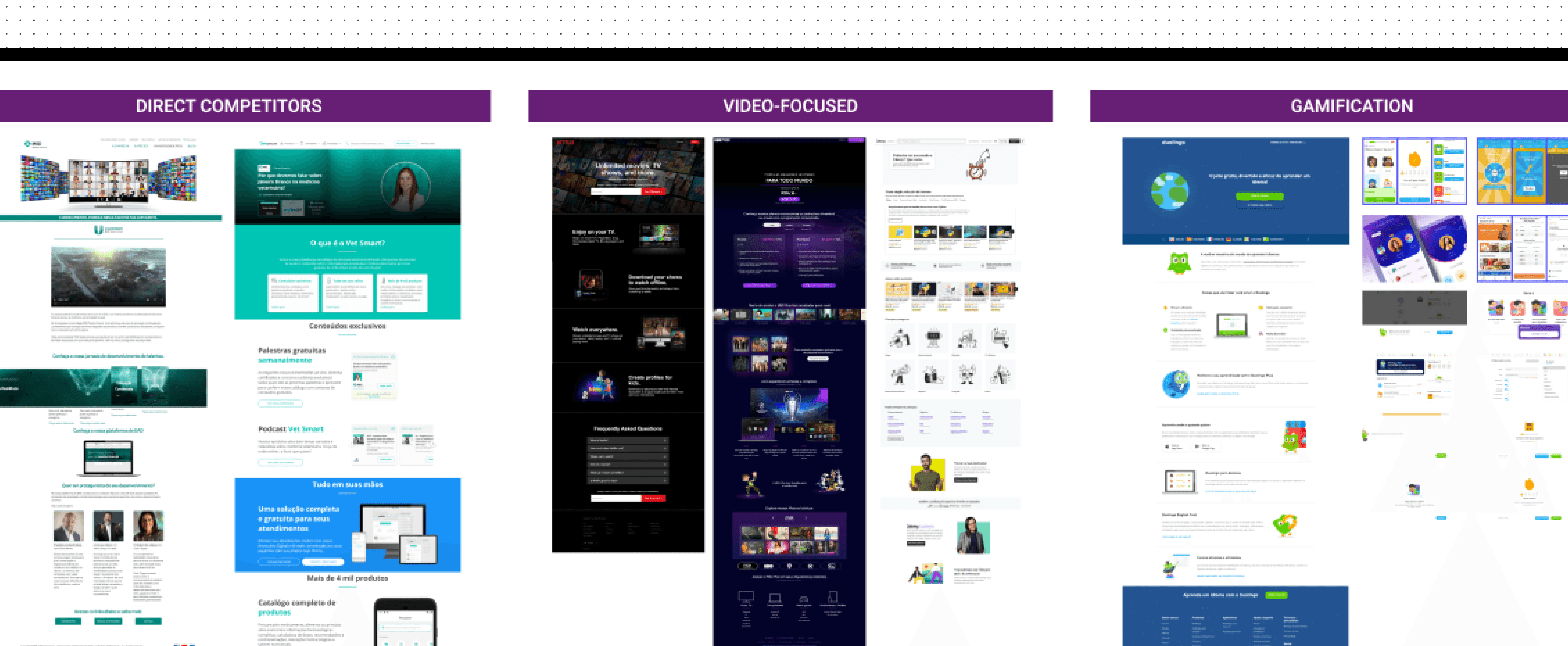
Findings
• Create a personalization of content to be shown based on the user preferences
• Landing page structure
• Gamification: Leaderboard
• Rewards for content watched and inviting friends, delivering a virtual currency to be used in a store with personalized content from well-known professionals.
• Certificate after completion of knowledge trail
Ideation:
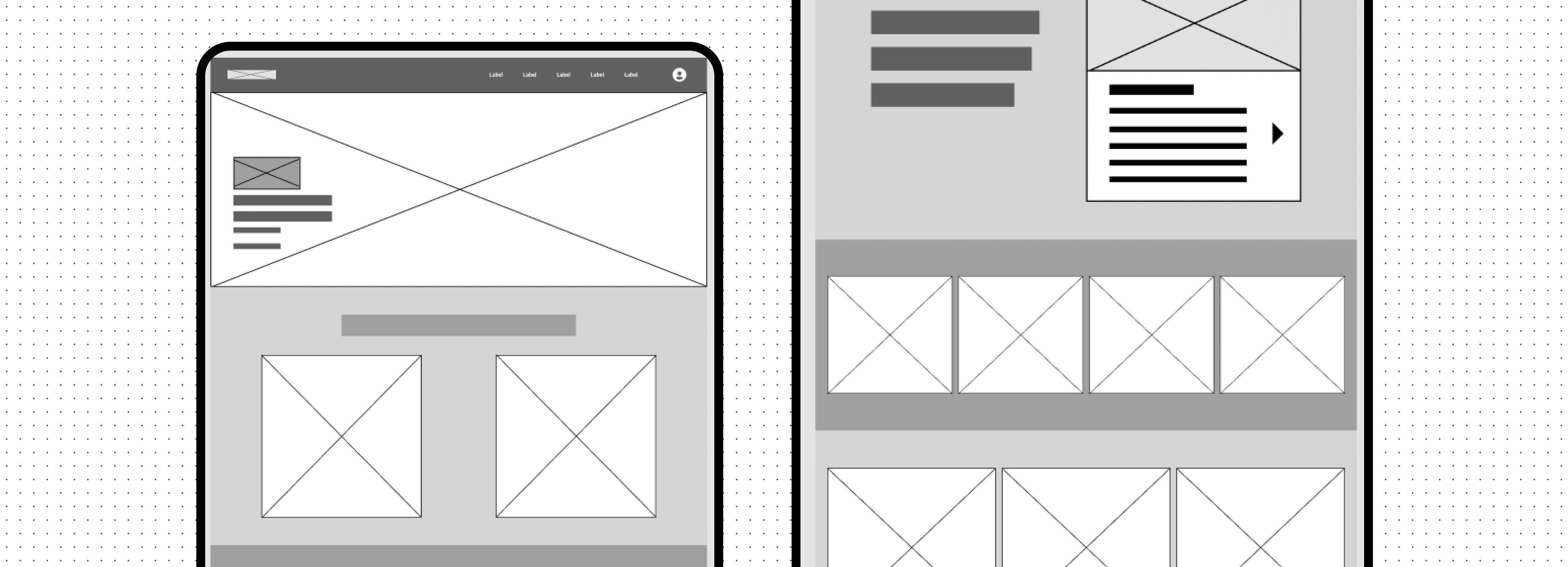
Wireframes
With a better understanding of the problem and the competitive analysis done, I went through a quick ideation stage with wireframes, where I worked on validating the structure and organization of the landing page elements of the product in low fidelity with some stakeholders.
Final design
About
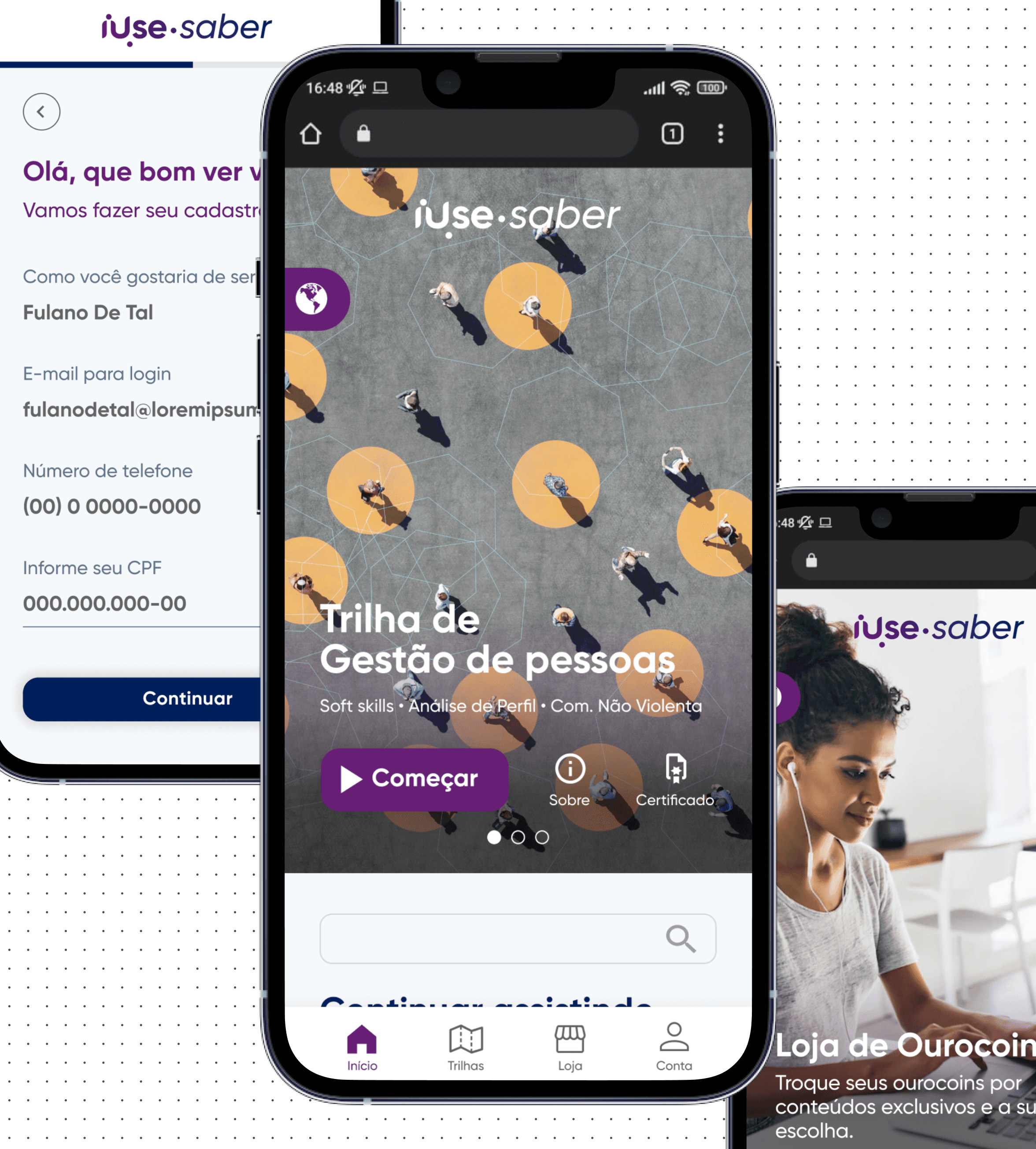
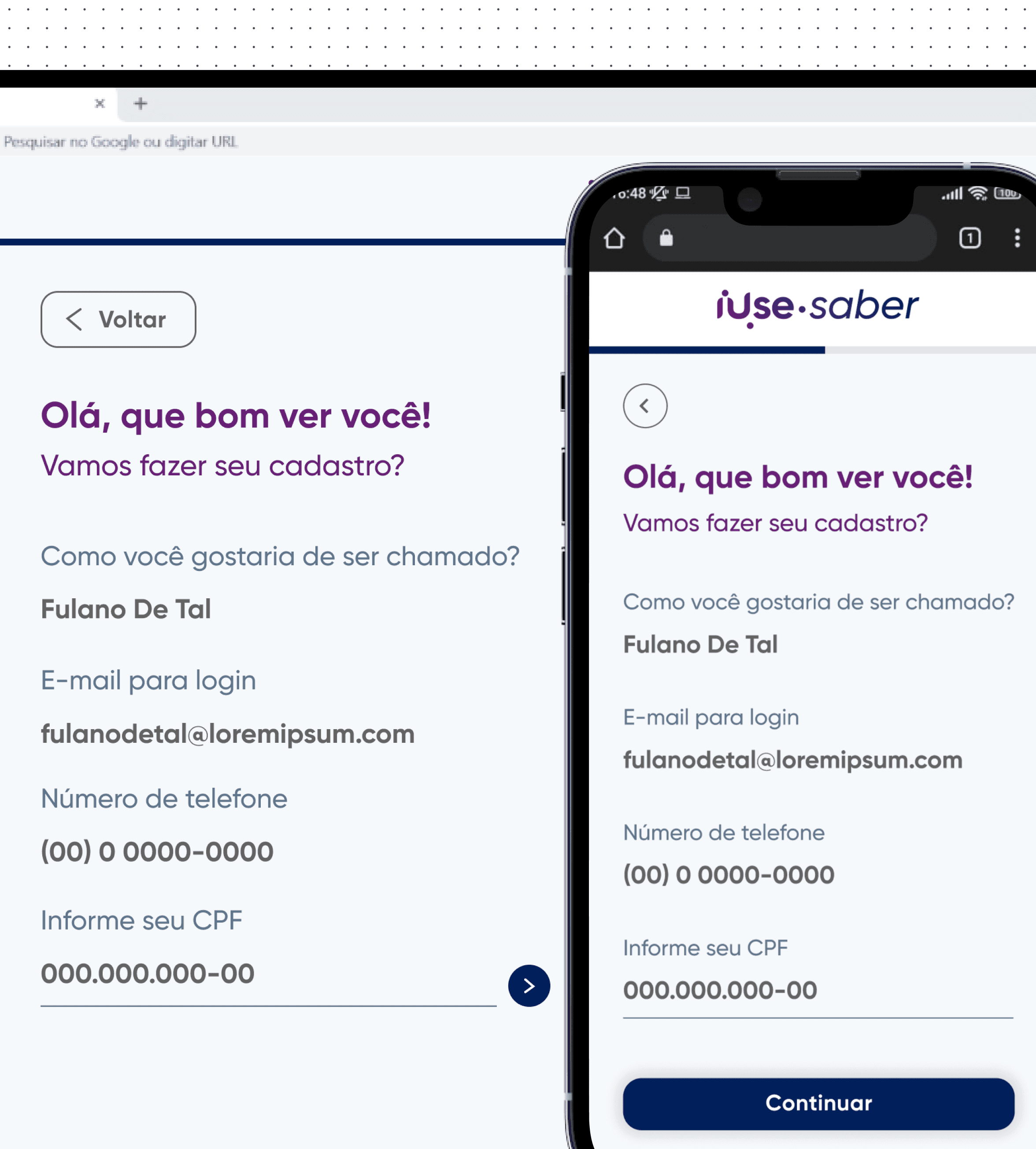
After going through all the steps of discovering the problem, defining it, and ideating, I designed the high-fidelity prototype, which was used for development.
Design system
Since the company lacked a design system for this project, I created the components from scratch.
Key learnings
• Establishing myself as a reference for product knowledge early in the project was crucial for guiding decisions and aligning the team.
• Conducting a competitive analysis provided valuable insights that shaped the project direction.
• Creating wireframes and prototypes without clear requirements or user stories resulted in challenges later in the project.
• The absence of usability testing limited our ability to validate assumptions and improve the user experience.
Results
Content Personalization
Enabled users to select content based on their preferences, improving engagement.
Gamification System
Introduced a gamification system with rewards for content watched, boosting user motivation and retention.
Personalized Experience
Tailored the user journey based on preferences, boosting satisfaction and usage.
9min
Average Session Duration on Launch
Ourofino - iUse Saber
Building from scratch a gamified e-learning platform for professionals across Latin America
Client
Ourofino
Client
Ourofino
My role
UX/UI Designer
My role
UX/UI Designer
Date
April 2022
Date
April 2022
Overview
iUse Saber is Ourofino's video-based learning platform aimed at individuals seeking personal and professional growth. It features a gamification system to reward users and focuses on providing a personalized experience based on the content watched.
Problem
statement
Ourofino set out to create a new mobile web learning platform, iUse Saber, to support personal and professional development for animal health professionals. The challenge was to design a customizable platform with knowledge trails, gamification, and virtual rewards, enabling users to access premium content for free. Without this solution, professionals would continue to face high costs and fragmented resources, limiting their growth and connection to the brand.
Guidelines
& Benchmark
Homepage design: 5 fundamental principles by NNGroup
Ensure easy access: The homepage should be easily accessible, as users often return to it if lost.
Communicate purpose: Clearly convey who you are and what users can do to avoid losing potential customers.
Showcase content: Use examples to encourage exploration and help users quickly find what they need.
Guide navigation: Provide clear actions and pathways to guide users effectively.
Keep it simple: Avoid clutter and distractions to enhance usability and credibility
Goals
My goal was to create a new solution for producers, managers, tutors, technicians, clerks, and students throughout Latin America that would have the following features:
Allow users to choose content of interest to watch
A Gamification system to reward users
Personalized experience for each user
Goals
Speed up the process
Decrease the delay in the review process
Have access to reports
Facilitate process monitoring by coordinators and managers
Centralize information
Highlights
6 out of 6
competitors have a ”Last viewed/Recently accessed” section at the home page.
4 out of 6
competitors have the ”Favorites” feature at the home page as a easy access to important content.
3 out of 6
Competitors have quick insights on the home page.
Usability tests
ABOUT THE TEST
8 users
2 Personas (Seller and Global Partner)
Moderated usability test using Lyssna
Goals
• Evaluate the ease of use and intuitiveness of the new main page
• Identify any usability issues that hinder the performance of the main tasks
• Collect feedback on overall user satisfaction with the new experience
Metrics to evaluate the tests
Prototype tested
Findings
I managed to find it because of the workspace name, but I don't understand what's a workspace or a segment means
User quote about workspaces
“
”
To keep
• Page structure
• Datasets
• Reports on the side navigation
To improve
• Workspaces
• Overall descriptions
• Big numbers
• Onboarding
• Reports section
Main takeaway
Workspaces
Review how we present the workspaces and review the top component
Proposal
New round of usability tests to validate proposed changes:
About the test
3 new users
1 Persona (Seller)
Moderated usability test using Figma
Goal
• Evaluate the proposed changes related to the workspaces
Findings
We usually change the view on the top of the page, it was the first thing that I noticed
User quote about top component
“
”
Proposal to next improvements
Final design
About
After going through all the steps of discovering the problem, defining it, and ideating, I designed the high-fidelity prototype, which was used for development.
Design system
Since the company lacked a design system for this project, I created the components from scratch.
Next steps
Key learnings
• Establishing myself as a reference for product knowledge early in the project was crucial for guiding decisions and aligning the team.
• Conducting a competitive analysis provided valuable insights that shaped the project direction.
• Creating wireframes and prototypes without clear requirements or user stories resulted in challenges later in the project.
• The absence of usability testing limited our ability to validate assumptions and improve the user experience.
Results
9min
Average Session Duration on Launch
Content Personalization
Enabled users to select content based on their preferences, improving engagement.
Gamification System
Introduced a gamification system with rewards for content watched, boosting user motivation and retention.
Personalized Experience
Tailored the user journey based on preferences, boosting satisfaction and usage.
Streamlined Workflow
Centralized tools reduced errors and simplified planning.
Improved Efficiency
Notifications and task filters optimized task management.
Validated Usability
98% success rate in tests with overwhelmingly positive feedback.
Enhanced Features
Added weekly task views and a unified observation page based on user input.
Highlights
100%
of users highlighted usability issues
80%
of users pointed out problems directly related to the system
70%
of users mentioned relying on external tools
Findings
• Reliance on external tools (e.g., Excel) for better filtering and analysis of cases.
• Poor communication between areas involved in the process.
• Dependence on the support team for customization.
• The process functions but requires improvement.
• Absence of integrations and automations.
• Limited system autonomy and user control.
I have to export everything and use excel sheets to analyse, because the filters don’t work in the system
- User quote during interview
“
”
Benchmark
I conducted a competitive analysis of the four most widely used solutions on the market to identify what works, what can be improved, how they present themselves visually, and how we can incorporate those insights into our new product.
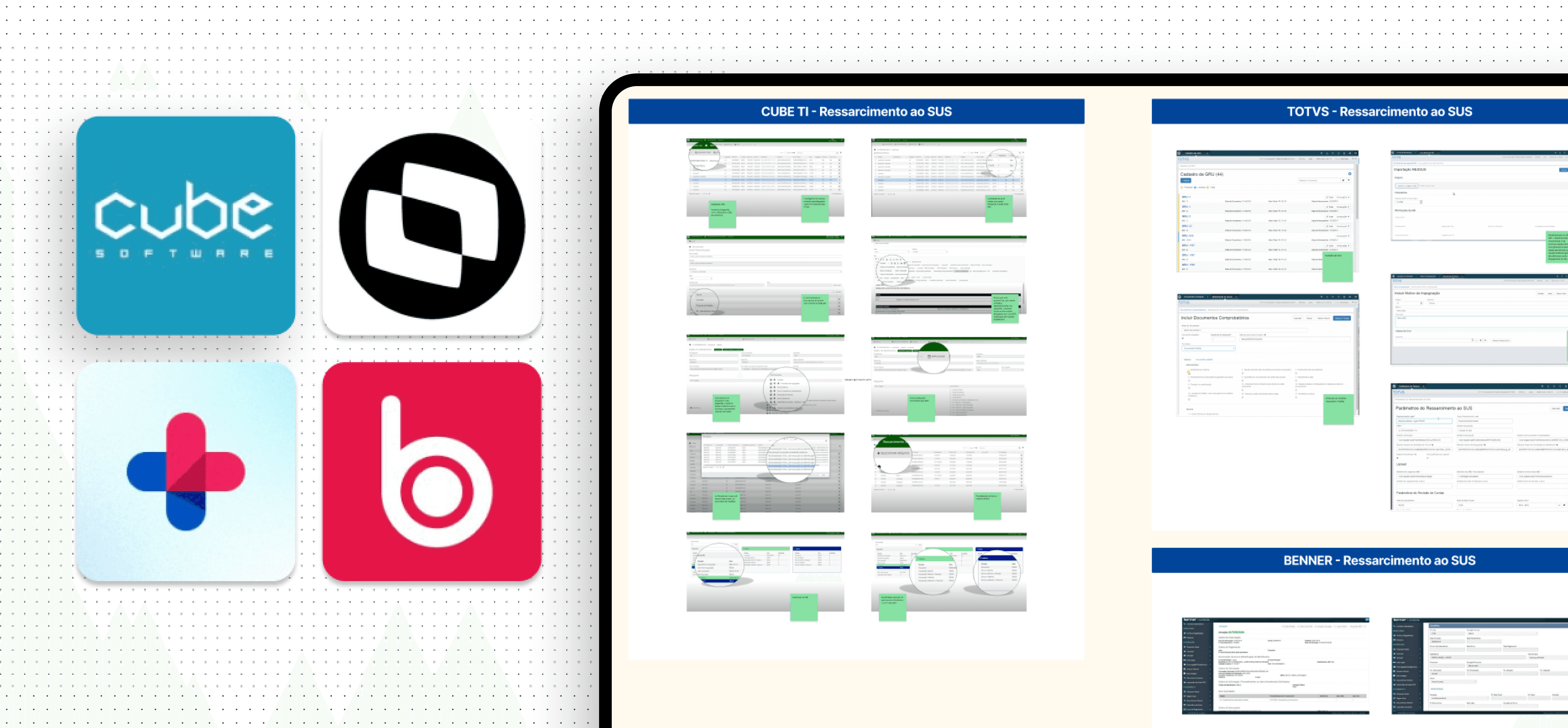
Findings
• The use of dashboards to quickly display key process data
• A focus on integrations and automation
• An intuitive system for managing documentation
Personas
Workshop
with users
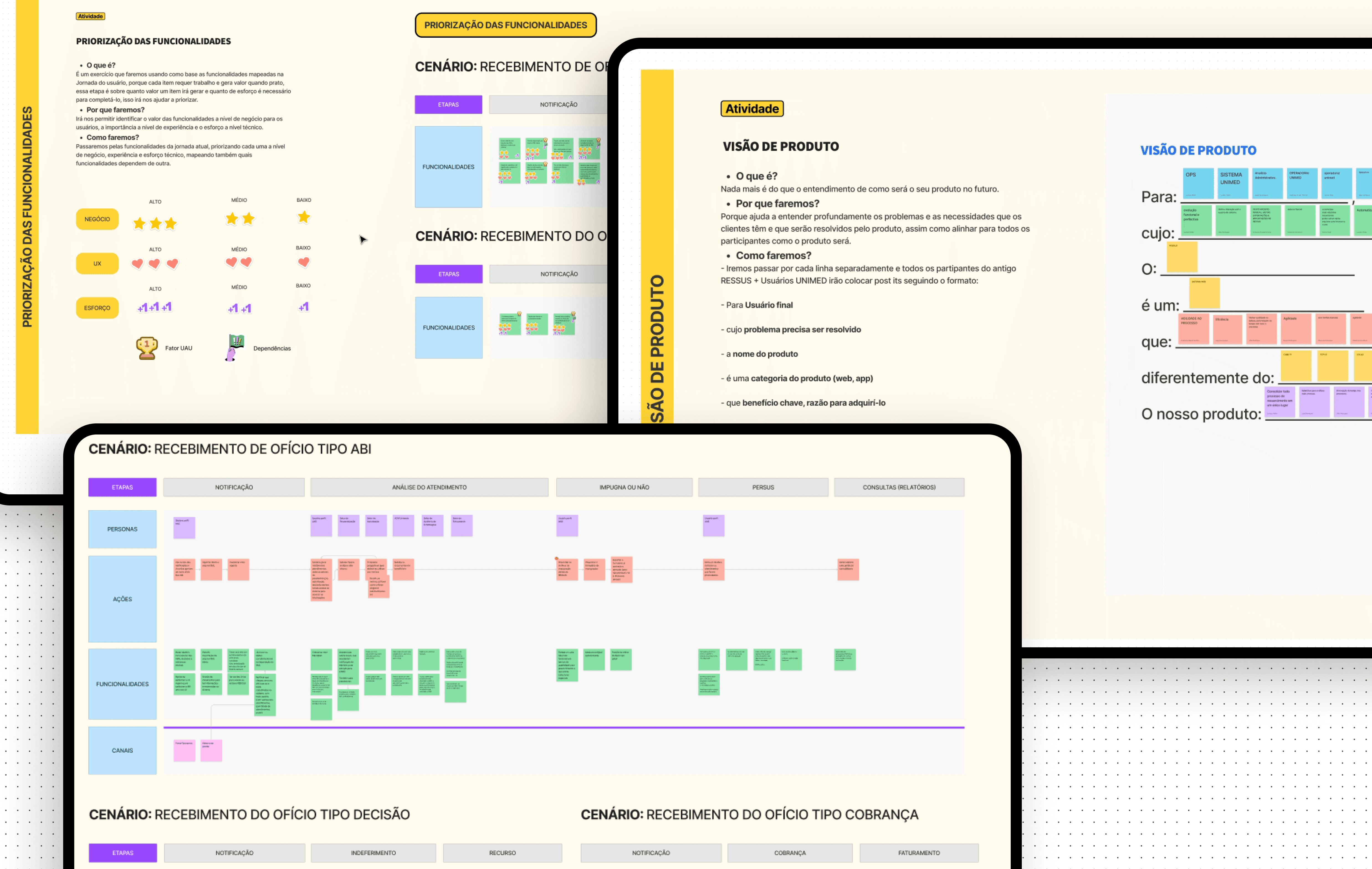
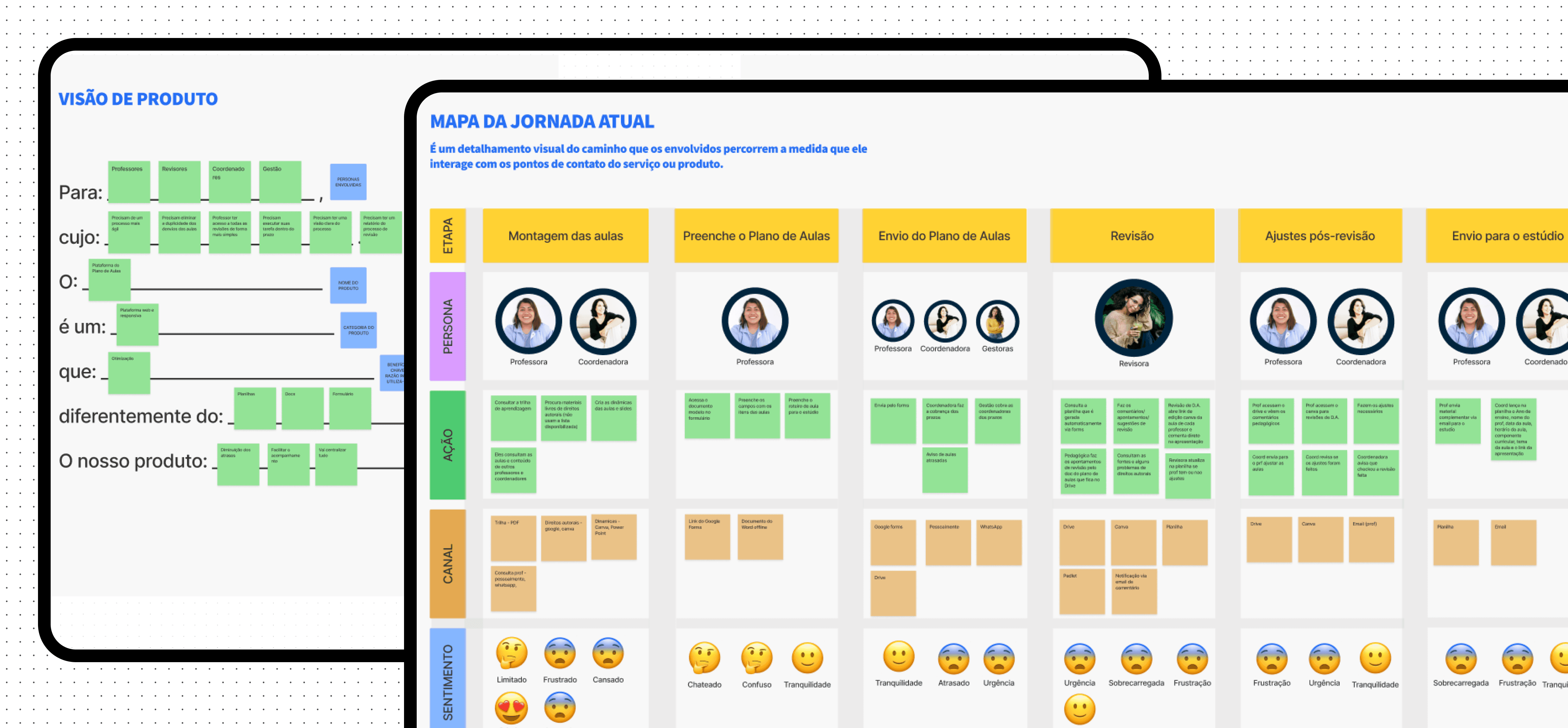
Entering the second stage of the process, I had a clearer understanding of the users and the problem. I decided to conduct a Lean Inception workshop to help validate the data collected during the discovery phase, align and plan the development of the new product. The workshop lasted five days: the first four included participation from users, POs, product managers, and engineers, while the final day focused on internal activities.
Outcomes
• A written product vision, aimed at better understanding the problems and needs that users face, which will be solved by the new product.
• User journey map, focused on solving the issues faced by Health Analysts. I mapped six journeys to better understand and visualize all the steps in the process, considering actions, channels, opportunities, and a features brainstorm.
• We focused on these scenarios: As is today / The arrival of a new process / The arrival of decision / The arrival of billing
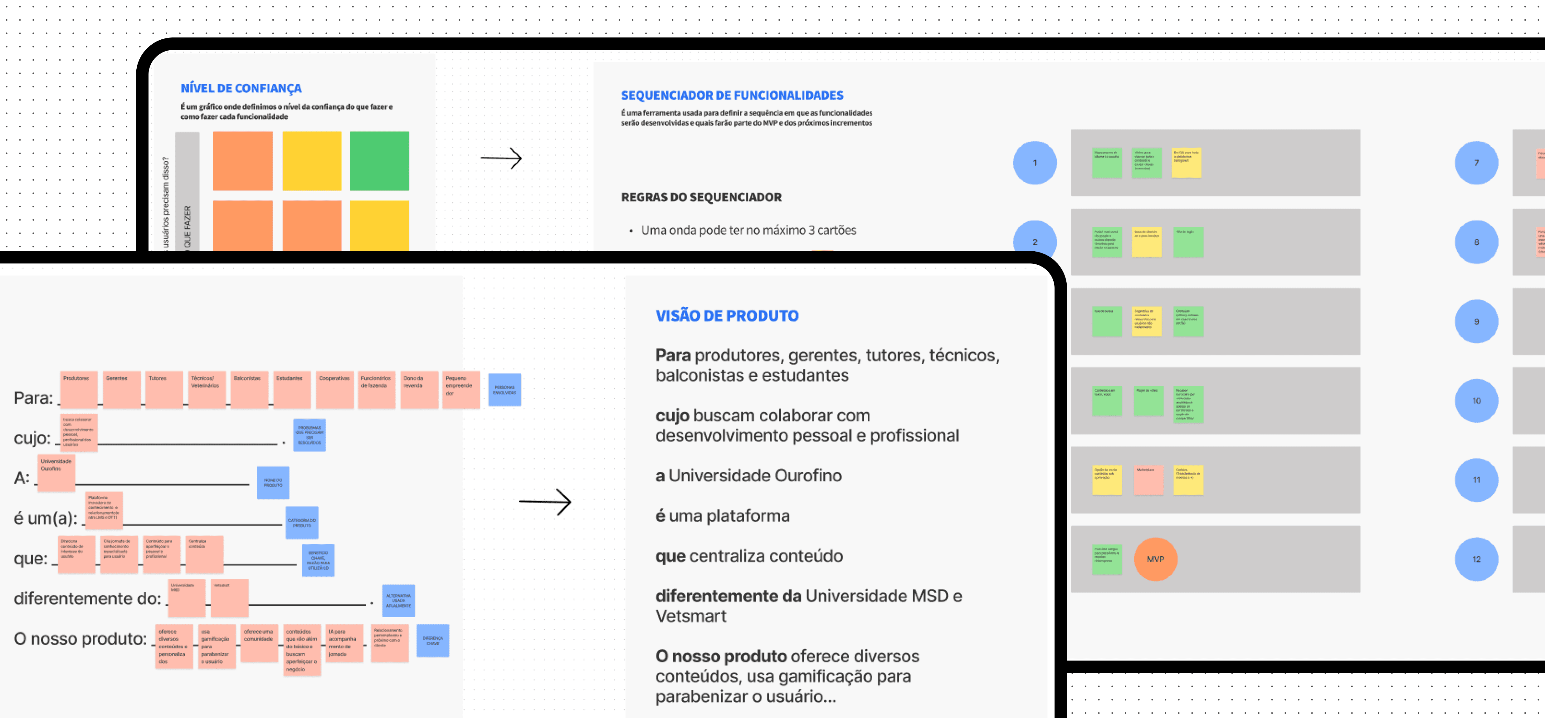
The features I mapped in the ideal journeys were later prioritized based on their value for the business, their impact from a User Experience perspective, and the development effort required. After prioritization, I created a Trust Matrix for each feature, considering how confident we were in the information needed to write user stories and how confident we were in developing them.
Once everything was set, I defined the MVP with a feature sequencer, considering all previous steps. On the last day of the workshop, I created a Product Backlog Canvas, where we broke down each feature into backlog items. These items were later broken down into tasks during the Planning Poker session, which we used to estimate the development time.
Solving the problem
Validation sessions
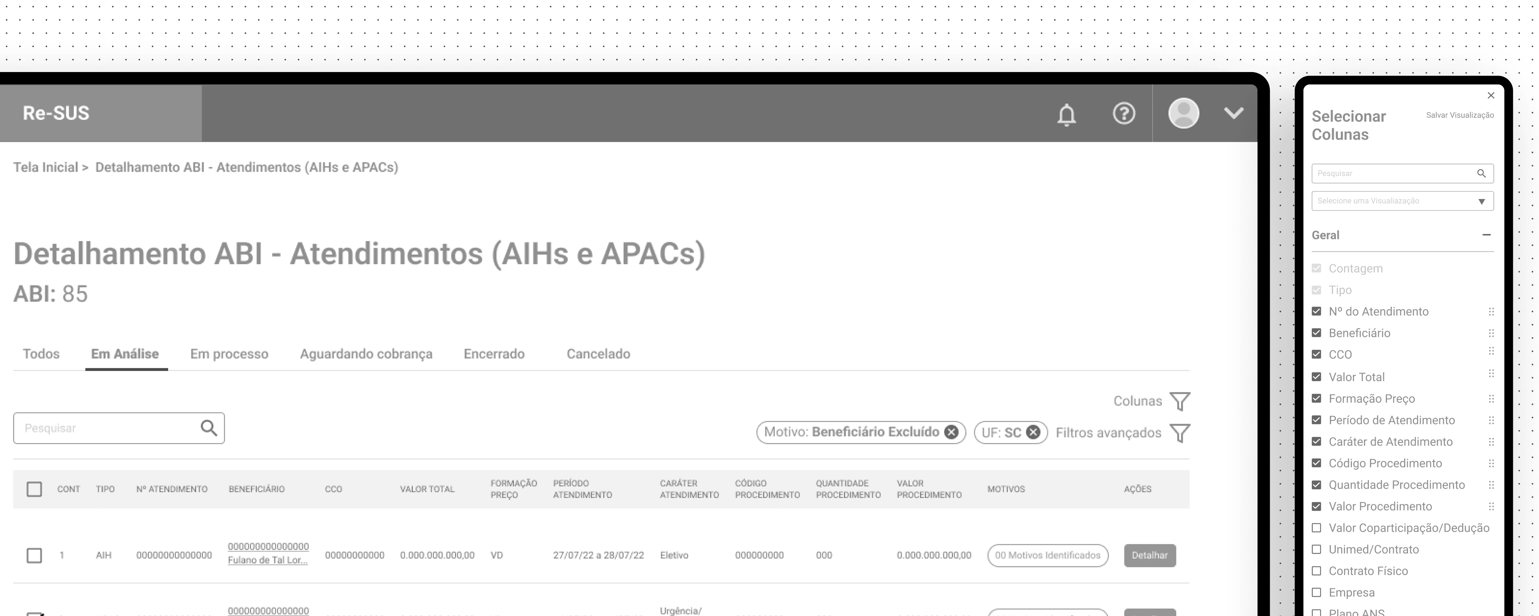
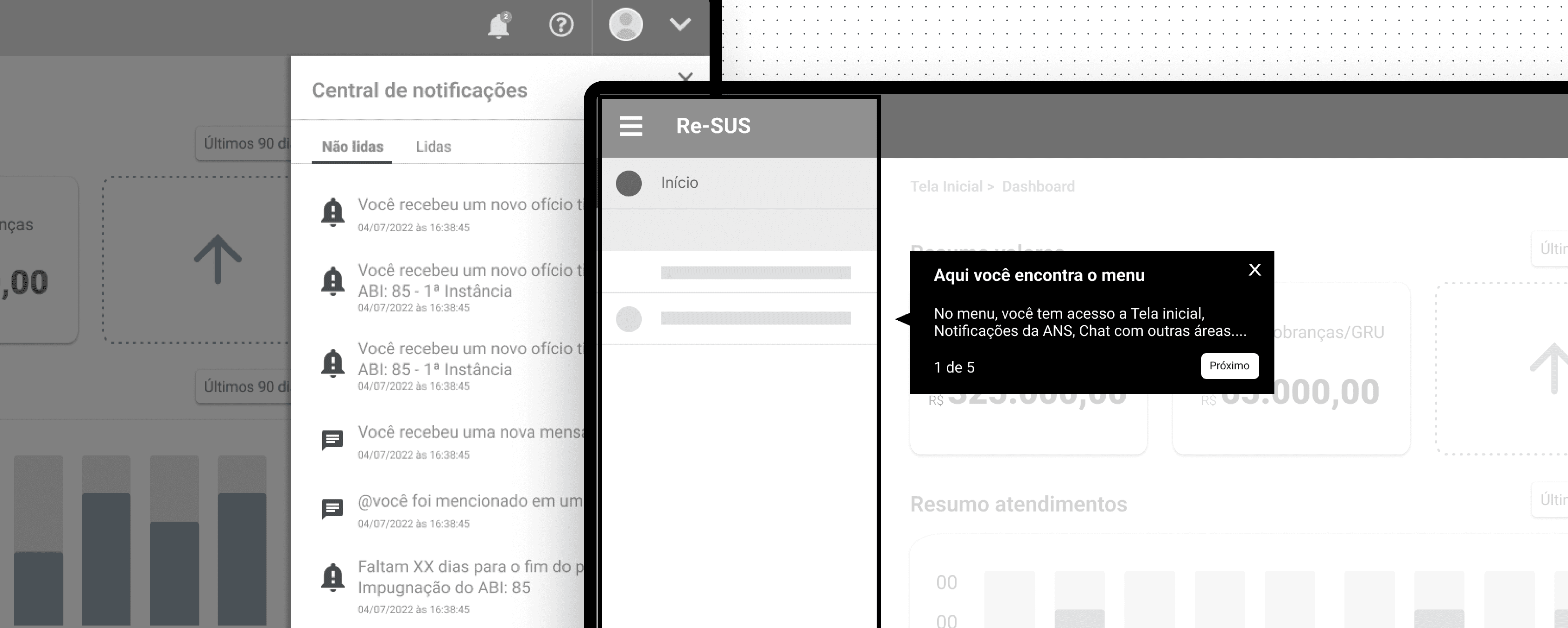
Moving on to the next stage, let's dive into how I proposed to solve the problem. I decided to validate the flows and feature ideas using wireframes. Over the course of a month, we held 4 sessions where I co-created ideas with the direct participation of users, validating in real time and gathering feedback on each screen individually.
Wireframes major
improvements
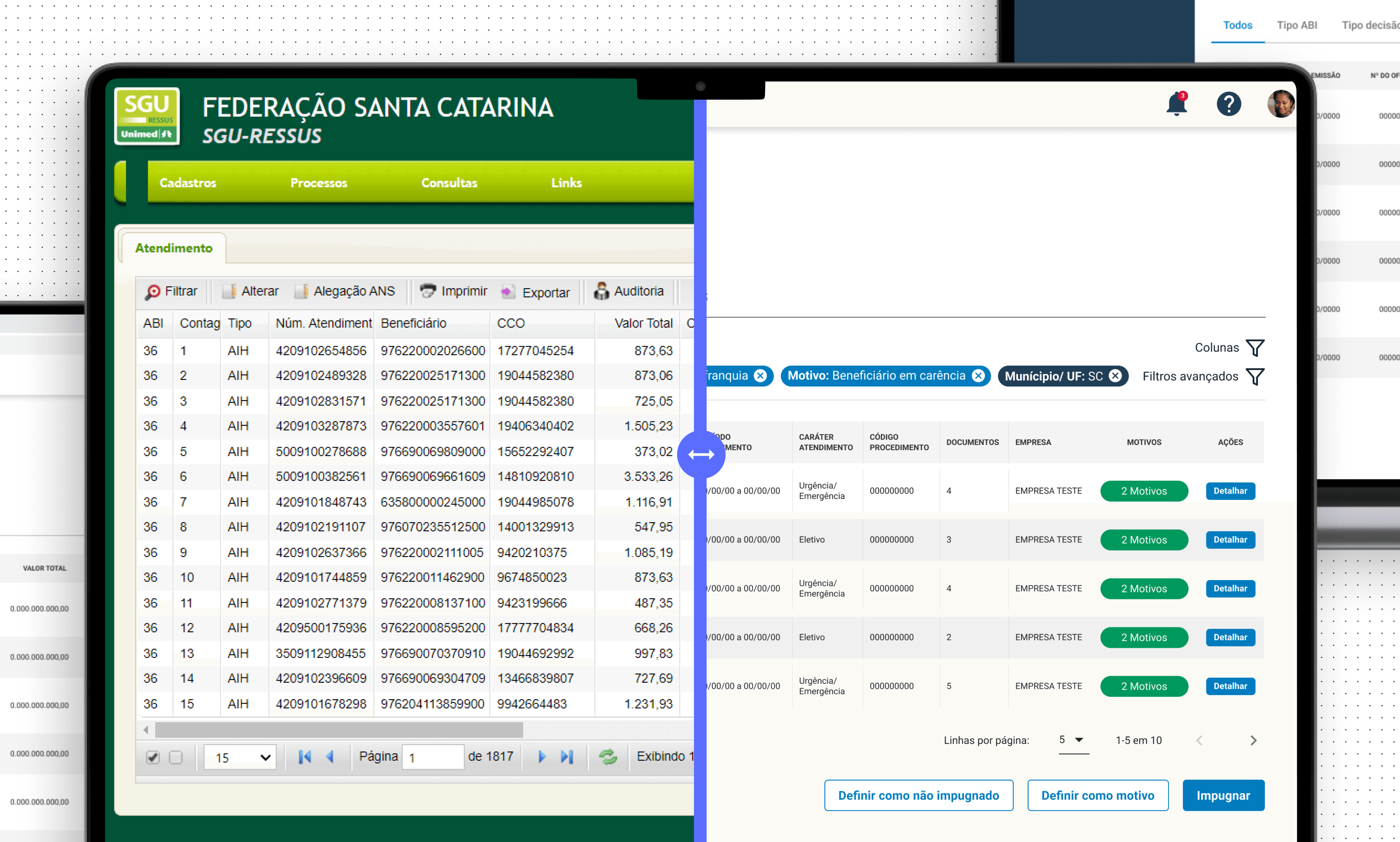
• One of the major improvements we implemented from these sessions was adding a column control that would work alongside the filters, better fitting users' needs to analyze multiple pieces of information simultaneously.
• We also introduced a guided onboarding experience, addressing the common challenge of new users within a health operator having to learn how to navigate the system.
Before x After redesign
Workshop
At the start of the project, I noticed significant uncertainty among the team and a tight execution deadline. I proposed conducting a three-day Lean Inception Workshop, based on Paulo Caroli, methodology, involving six stakeholders.
Goals
• Understand the challenge
•Align and plan the building of the product
Outcomes
• Product Vision
• User Journey Map
• MVP and it’s features
Benchmark
After a better understanding of the project's challenges, I did a Benchmark to analyze some key points: How do competitors present themselves visually? What are the product's main features? What can be improved?
Findings
• Create a personalization of content to be shown based on the user preferences
• Landing page structure
• Gamification: Leaderboard
• Rewards for content watched and inviting friends, delivering a virtual currency to be used in a store with personalized content from well-known professionals.
• Certificate after completion of knowledge trail
Ideation: Wireframes
With a better understanding of the problem and the competitive analysis done, I went through a quick ideation stage with wireframes, where I worked on validating the structure and organization of the landing page elements of the product in low fidelity with some stakeholders.
Research
We started the project with a research stage, in order to better understand users and their needs, identify the main pain points in the current process and possible opportunities. With that in mind, and taking into account the geographic limitation, we created a research plan using quantitative and qualitative research, where we were be able to interview users from the 4 areas involved in the process and collect the necessary data.
Findings and Insights
What is the hardest thing in planning classes?
• 75% of users mentioned dealing with copyrights
What are the difficulties in the review process?
• 60% of users mentioned reviewers take too much time to answer
I miss receiving feedback from changes and approvals
- Teachers during interview
“
”
They make changes to the link at the last minute and it cause errors
- Studio responsible during interview
“
”
Personas
Based on the data we obtained in the research stage, we created four personas, to map all possible user needs, validate with stakeholders, and guide us through the process.
Benchmark
Diving deeper into the discovery process, we did a competitive analysis of two competitors based on planning and process management (Trello and Monday): How do they present themselves? What are its main features?
Findings
In the competitive analysis process, we had some insights that helped us bring important features to the project, such as:
• Assign a person responsible for each task
• Well define deadlines
• Monitoring the entire process
• Overview with process information
Workshop
To finish up the discovery stage, we held a Lean Inception Workshop with users and stakeholders, following the methodology of Paulo Caroli.
Goals
• Validate the information collected in the research stage
• Align and plan the building of the new product

Outcomes
• Product Vision
• User Journey Map (AS IS and TO BE)
• MVP and it’s features
• Product Backlog
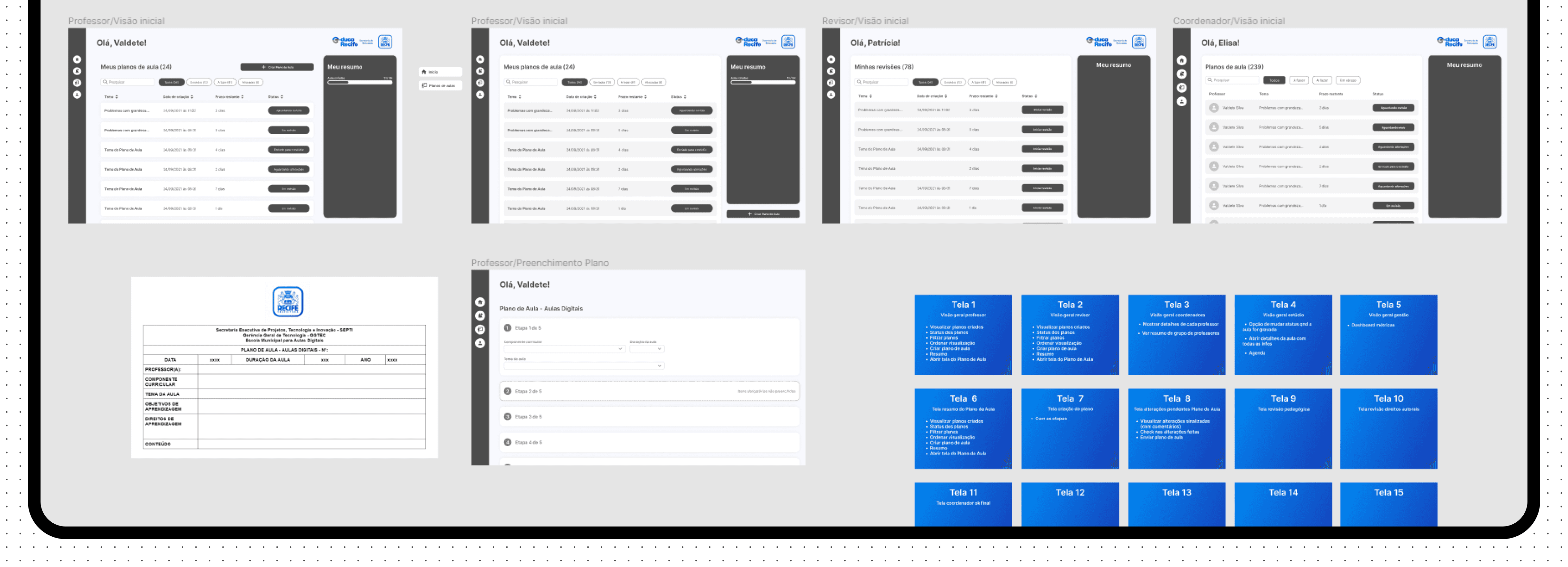
Ideation: Wireframes
After the discovery with a better understanding of the challenge, the journeys already mapped and the MVP with its defined features, we entered the ideation stage, where we decided to use wireframes to validate the user flows and features.
Usability tests
ABOUT THE TEST
8 users
1 Persona (Seller)
Moderated usability test using Figma
Goals
• Validate key tasks
• Collect as much feedback as possible
Highlights and findings
Everything in one place
Users appreciated having all areas unified in one system for better process tracking
98%
Task sucess completion rate across all four areas involved in the process
Good Usability and user friendly
Most participants found the system easy to use and well-organized.
Everything feels centralized and easy to access, with highlighted and organized deadlines.
- User quote during tests
“
”
What we
could improve
• Streamlining Observations: Participants preferred having all observations consolidated in one place to save time, eliminating the need for separate pages to add and confirm observations.
• Weekly Task Overview: Feedback suggested introducing a weekly task view to enhance process visibility and planning.
• Notification Management: Users expressed concerns about potential notification overload, indicating the need for a more manageable system.
• Lesson Observations: It became evident that adding an option for observations specific to unrecorded lessons would address key user needs.
Ourofino - iUse Saber
Building from scratch a gamified e-learning platform for professionals across Latin America
Client
Ourofino
Client
Ourofino
My role
UX/UI Designer
My role
UX/UI Designer
Date
April 2022
Date
April 2022
Overview
iUse Saber is Ourofino's video-based learning platform aimed at individuals seeking personal and professional growth. It features a gamification system to reward users and focuses on providing a personalized experience based on the content watched.
Problem statement
Ourofino set out to create a new mobile web learning platform, iUse Saber, to support personal and professional development for animal health professionals. The challenge was to design a customizable platform with knowledge trails, gamification, and virtual rewards, enabling users to access premium content for free. Without this solution, professionals would continue to face high costs and fragmented resources, limiting their growth and connection to the brand.
Guidelines & Benchmark
Homepage design: 5 fundamental principles by NNGroup
Ensure easy access: The homepage should be easily accessible, as users often return to it if lost.
Communicate purpose: Clearly convey who you are and what users can do to avoid losing potential customers.
Showcase content: Use examples to encourage exploration and help users quickly find what they need.
Guide navigation: Provide clear actions and pathways to guide users effectively.
Keep it simple: Avoid clutter and distractions to enhance usability and credibility
Goals
Speed up the process
Decrease the delay in the review process
Have access to reports
Facilitate process monitoring by coordinators and managers
Centralize information
Goals
Speed up the process
Decrease the delay in the review process
Have access to reports
Facilitate process monitoring by coordinators and managers
Centralize information
Highlights
6 out of 6
competitors have a ”Last viewed /Recently accessed” section at the home page.
4 out of 6
competitors have the ”Favorites” feature at the home page as a easy access to important content.
3 out of 6
Competitors have quick insights on the home page.
Usability tests
ABOUT THE TEST
8 users
2 Personas (Seller and Global Partner)
Moderated usability test using Lyssna
Goals
• Evaluate the ease of use and intuitiveness of the new main page
• Identify any usability issues that hinder the performance of the main tasks
• Collect feedback on overall user satisfaction with the new experience
Metrics to evaluate the tests
Prototype tested
Findings
I managed to find it because of the workspace name, but I don't understand what's a workspace or a segment means
User quote about workspaces
“
”
To keep
• Page structure
• Datasets
• Reports on the side navigation
To improve
• Workspaces
• Overall descriptions
• Big numbers
• Onboarding
• Reports section
Main takeaway
Workspaces
Review how we present the workspaces and review the top component
Proposal
New round of usability tests to validate proposed changes:
ABOUT THE TEST
3 new users
1 Persona (Seller)
Moderated usability test using Figma
Goal
• Evaluate the proposed changes related to the workspaces.
Findings
We usually change the view on the top of the page, it was the first thing that I noticed
User quote about top component
“
”
Proposal to next improvements
Final design
About the design
After all the tests and definitions,
I moved on to the final design proposal, addressing the most important changes.
Design system
The majority of the project was built using the company Design system.
Next steps
Key learnings
• Establishing myself as a reference for product knowledge early in the project was crucial for guiding decisions and aligning the team.
• Conducting a competitive analysis provided valuable insights that shaped the project direction.
• Creating wireframes and prototypes without clear requirements or user stories resulted in challenges later in the project.
• The absence of usability testing limited our ability to validate assumptions and improve the user experience.
Results
9min
Average Session Duration on Launch
Content Personalization
Enabled users to select content based on their preferences, improving engagement.
Gamification System
Introduced a gamification system with rewards for content watched, boosting user motivation and retention.
Personalized Experience
Tailored the user journey based on preferences, boosting satisfaction and usage.
Streamlined Workflow
Centralized tools reduced errors and simplified planning.
Improved Efficiency
Notifications and task filters optimized task management.
Validated Usability
98% success rate in tests with overwhelmingly positive feedback.
Enhanced Features
Added weekly task views and a unified observation page based on user input.
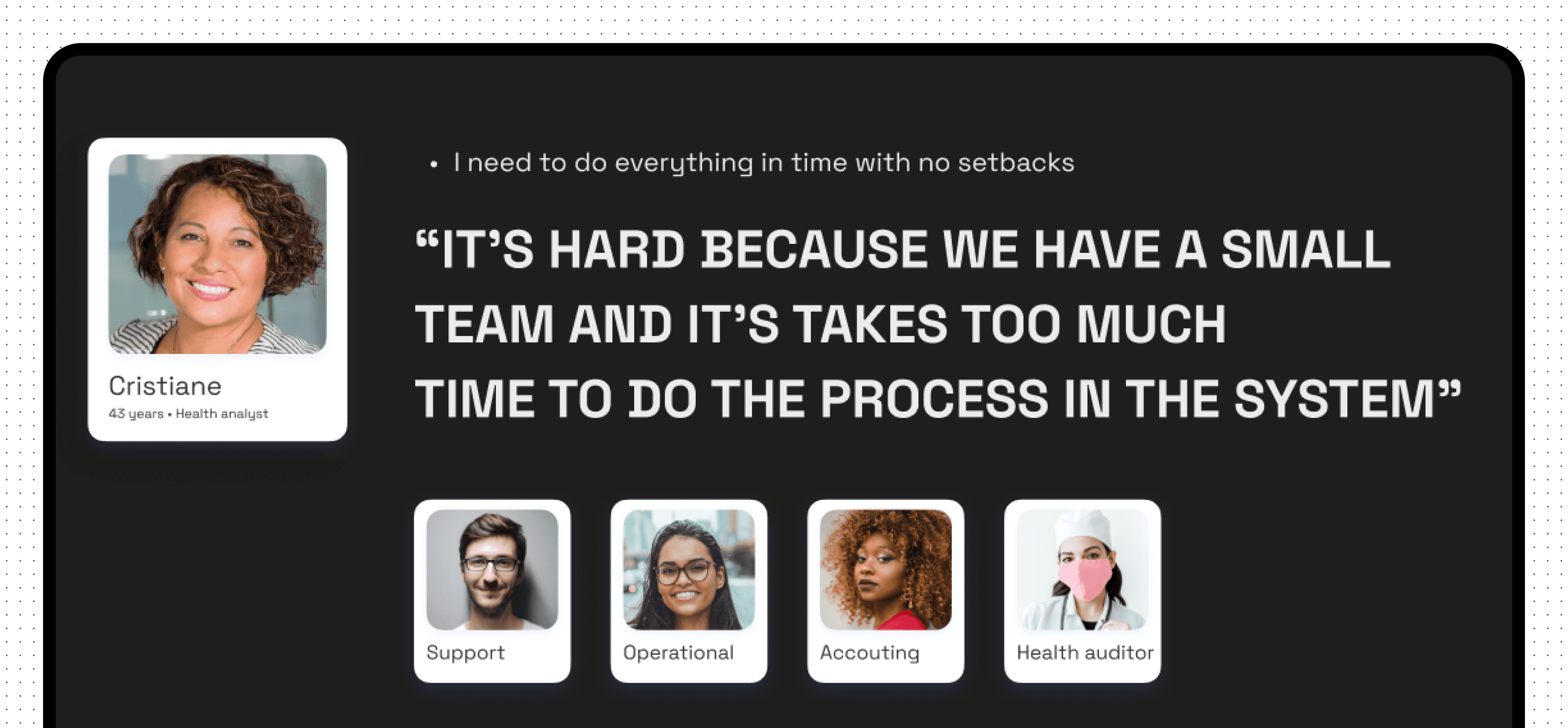
User interviews
Even with the information I already had, I wanted to hear directly from the users about their experience with the current product. I developed a research plan and conducted interviews with 15 users involved in all steps of the process, including analysts, accounting, and support teams.
Goals
• Identify pain points in the process
• Gain insights for the new product
Highlights
100%
of users highlighted usability issues
80%
of users pointed out problems directly related to the system
70%
competitors have a ”Last viewed /Recently accessed” section at the home page.
Findings
• Reliance on external tools (e.g., Excel) for better filtering and analysis of cases.
• Poor communication between areas involved in the process.
• Dependence on the support team for customization.
• The process functions but requires improvement.
• Absence of integrations and automations.
• Limited system autonomy and user control.
I have to export everything and use excel sheets to analyse, because the filters don’t work in the system
- User quote during interview
“
”
Benchmark
I conducted a competitive analysis of the four most widely used solutions on the market to identify what works, what can be improved, how they present themselves visually, and how we can incorporate those insights into our new product.
Findings
• The use of dashboards to quickly display key process data
• A focus on integrations and automation
• An intuitive system for managing documentation
Personas
Workshop with users
Entering the second stage of the process, I had a clearer understanding of the users and the problem. I decided to conduct a Lean Inception workshop to help validate the data collected during the discovery phase, align and plan the development of the new product. The workshop lasted five days: the first four included participation from users, POs, product managers, and engineers, while the final day focused on internal activities.
Outcomes
• A written product vision, aimed at better understanding the problems and needs that users face, which will be solved by the new product.
• User journey map, focused on solving the issues faced by Health Analysts. I mapped six journeys to better understand and visualize all the steps in the process, considering actions, channels, opportunities, and a features brainstorm.
• We focused on these scenarios: As is today / The arrival of a new process / The arrival of decision / The arrival of billing
The features I mapped in the ideal journeys were later prioritized based on their value for the business, their impact from a User Experience perspective, and the development effort required. After prioritization, I created a Trust Matrix for each feature, considering how confident we were in the information needed to write user stories and how confident we were in developing them.
Once everything was set, I defined the MVP with a feature sequencer, considering all previous steps. On the last day of the workshop, I created a Product Backlog Canvas, where we broke down each feature into backlog items. These items were later broken down into tasks during the Planning Poker session, which we used to estimate the development time.
Solving the problem
Validation sessions
Moving on to the next stage, let's dive into how I proposed to solve the problem. I decided to validate the flows and feature ideas using wireframes. Over the course of a month, we held 4 sessions where I co-created ideas with the direct participation of users, validating in real time and gathering feedback on each screen individually.
Wireframes major
improvements
• One of the major improvements we implemented from these sessions was adding a column control that would work alongside the filters, better fitting users' needs to analyze multiple pieces of information simultaneously.
• We also introduced a guided onboarding experience, addressing the common challenge of new users within a health operator having to learn how to navigate the system.
Before x After redesign
Workshop
At the start of the project, I noticed significant uncertainty among the team and a tight execution deadline. I proposed conducting a three-day Lean Inception Workshop, based on Paulo Caroli, methodology, involving six stakeholders.
Goals
• Understand the challenge
•Align and plan the building of the product
Outcomes
• Product Vision
• User Journey Map
• MVP and it’s features
Benchmark
After a better understanding of the project's challenges, I did a Benchmark to analyze some key points: How do competitors present themselves visually? What are the product's main features? What can be improved?
Findings
• Create a personalization of content to be shown based on the user preferences
• Landing page structure
• Gamification: Leaderboard
• Rewards for content watched and inviting friends, delivering a virtual currency to be used in a store with personalized content from well-known professionals.
• Certificate after completion of knowledge trail
Ideation: Wireframes
With a better understanding of the problem and the competitive analysis done, I went through a quick ideation stage with wireframes, where I worked on validating the structure and organization of the landing page elements of the product in low fidelity with some stakeholders.
Research
We started the project with a research stage, in order to better understand users and their needs, identify the main pain points in the current process and possible opportunities. With that in mind, and taking into account the geographic limitation, we created a research plan using quantitative and qualitative research, where we were be able to interview users from the 4 areas involved in the process and collect the necessary data.
Findings and Insights
What is the hardest thing in planning classes?
• 75% of users mentioned dealing with copyrights
What are the difficulties in the review process?
• 60% of users mentioned reviewers take too much time to answer
I miss receiving feedback from changes and approvals
- Teachers during interview
“
”
They make changes to the link at the last minute and it cause errors
- Studio responsible during interview
“
”
Personas
Based on the data we obtained in the research stage, we created four personas, to map all possible user needs, validate with stakeholders, and guide us through the process.
Benchmark
Diving deeper into the discovery process, we did a competitive analysis of two competitors based on planning and process management (Trello and Monday): How do they present themselves? What are its main features?
Findings
In the competitive analysis process, we had some insights that helped us bring important features to the project, such as:
• Assign a person responsible for each task
• Well define deadlines
• Monitoring the entire process
• Overview with process information
Workshop
To finish up the discovery stage, we held a Lean Inception Workshop with users and stakeholders, following the methodology of Paulo Caroli.
Goals
• Validate the information collected in the research stage
• Align and plan the building of the new product
Outcomes
• Product Vision
• User Journey Map (AS IS and TO BE)
• MVP and it’s features
• Product Backlog
Ideation: Wireframes
After the discovery with a better understanding of the challenge, the journeys already mapped and the MVP with its defined features, we entered the ideation stage, where we decided to use wireframes to validate the user flows and features.
Usability tests
ABOUT THE TEST
8 users
1 Persona (Seller)
Moderated usability test using Figma
Goals
• Evaluate the proposed changes related to the workspaces.
Highlights and findings
98%
Task sucess completion rate across all four areas involved in the process
Everything in one place
Users appreciated having all areas unified in one system for better process tracking
Good usability and user friendly
Most participants found the system easy to use and well-organized.
Everything feels centralized and easy to access, with highlighted and organized deadlines.
- User quote during tests
“
”
What we could improve
• Streamlining Observations: Participants preferred having all observations consolidated in one place to save time, eliminating the need for separate pages to add and confirm observations.
• Weekly Task Overview: Feedback suggested introducing a weekly task view to enhance process visibility and planning.
• Notification Management: Users expressed concerns about potential notification overload, indicating the need for a more manageable system.
• Lesson Observations: It became evident that adding an option for observations specific to unrecorded lessons would address key user needs.